A simple area with a few enemies trying to stop you from opening the main area.
Once you are in there, get ready for a tough fight.
Good Luck!
Basic Details
- Title: Revelation
- Filename: hl2-ep2-sp-revelation.7z
- Size : 589KB
- Author: BadPeace
- Date Released: 06 March 2016
Gauge Users
Download directly into Gauge [589KB]
You MUST have MapTap installed before using this link.
Download Options
Download to your HDD [589KB]
You can still use it with Gauge once you have downloaded it.
Manual Installation Instructions
If you require more help, please visit the Technical Help page.
- Copy the revelation.bsp file into your …\Steam\SteamApps\common\Half-Life 2\ep2\maps\ folder.
- Launch Half-Life 2: Episode Two
- Open the console and type map revelation and now press ENTER.
Videos
Coming Soon.
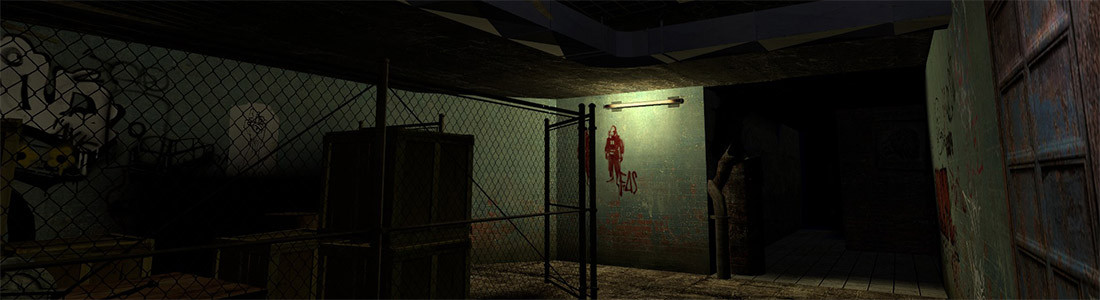
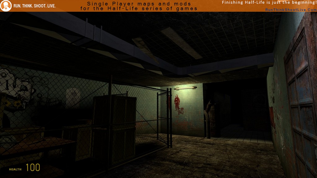
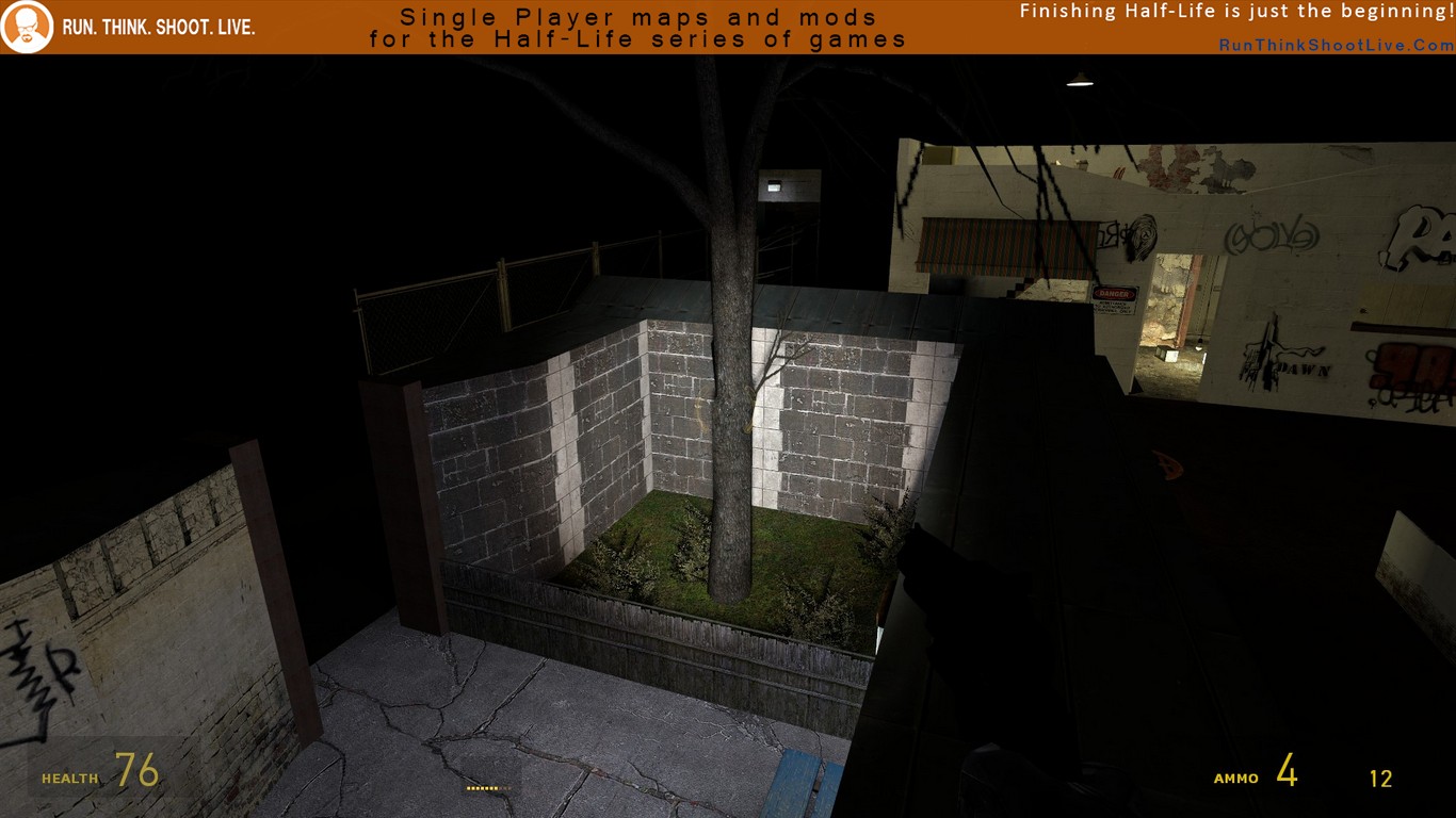
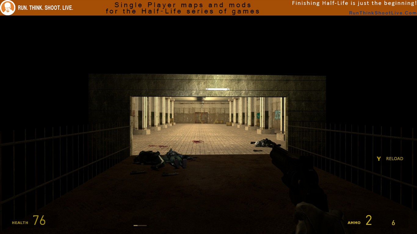
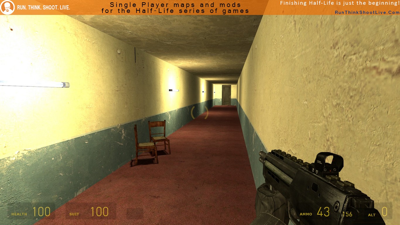
Screenshots
The images below are the chapter images. More screenshots will be posted once Phillip has started the mod.
WARNING: The screenshots contain spoilers.
1024 x 576
 |
 |
 |
 |
1366 x 768
 |
 |
 |
 |
1600 x 900
 |
 |
 |
 |
Reader Recommendations
Total Downloads
-
947Overall
-
1Today
-
1Last 7 days
-
12Last 30 days
-
76365 days
Meta Review Data
Statistics based on 12 comment(s) with meta review data.
Installed:
Using Gauge: Users
Manually: 9 Users
Time Taken:
Average: 0 Hours, 12 Mins
Shortest: 0 Hours, 5 Mins by Daken50
Longest: 0 Hours, 20 Mins by Quaskie
Total Time Played: 2 Hours, 21 Mins
Using Gauge: Users
Manually: 9 Users
Time Taken:
Average: 0 Hours, 12 Mins
Shortest: 0 Hours, 5 Mins by Daken50
Longest: 0 Hours, 20 Mins by Quaskie
Total Time Played: 2 Hours, 21 Mins
Tags (?)
Collections (?)
This release is currently not in a collection
If you believe this release is missing important tags, please suggest them in a comment?
Jump to a review


Let me tell you the story of this first map.
BadPeace contacted me and asked me to post the map. I agreed (because that’s what I do!) and played it.
I then contacted him again and said that to be honest, this should not be published as it needs too much work, but I left the final choice with him as he could easily upload it to another website.
I listed my issue and he said that since it was his first map, he still wanted as much feedback as possible and was prepared for lots of negatives and was already working on a new and better map.
I feel that’s a very good approach to have: being open to criticism and willing to learn from it.
I still stand by my initial appraisal but respect his choice.
SO here it is.
Don’t be gentle just because it is a first map but don’t be rude either.
Very quickly, here are my points:
1. This is the sort of map you build and then keep on your hard drive. It’s a learning process.
2. You can easily jump out of the map and it’s clearly not finished or an abstract idea.
3. It’s possible to put barrels by the sides of the shutting door and get out before the metrocops come in and break the map.
4. The final battle is repetitive and much harder than it should be. There’s no obvious reason for them to come in waves and the area is not interesting enough to run around. It’s the sort of area you get in MP maps.
I say Avoid it.
Using Gauge
Medium
8 Minutes
Oh gosh, it’s the P-Man!
This is pretty much how everyone’s first map goes. Mine did.
Lets get on with the issues
Lighting
Flashing lights, there should always be one backup so it does not flash bright and go pitch black constantly, the opening lights that flashed drove my eyes nuts and I don’t really experience that many issues with eye strain.
The outdoors section of the map, it would be best that you check out skyboxes for it, and a light_environment, because it killed any sense of realism to walk out into a courtyard floating above the dark void.
Puzzles
Find the button, first one was noticeably flawed, hiding it behind crates is fine but there really should be better visual hinting towards it or even what we are searching for to begin with. In addition the rooms lighting made it harder.
The other button challenge had the same issue, no real telling as to what we were looking for or any idea where to look, the darkness of the area left me failing to notice the button multiple times. (even hopped into the void to see if that would be the solution)
Combat
You used one NPC, with the same weapon and that was it, fights were not fun and you left the player with too little to use, revolver and SMG (+grenade from item crate)
More enemy and weapon variety is needed.
Arena
Just, bad. It goes too long, the enemies come in from rooms they had no way of getting into, crates are just littered about without any consideration. Despite getting tons of batteries and health kits, I still died multiple times because there is not enough cover and too many enemies appear (and they never really did move around unless I forced them to with a grenade)
End
No payoff at all, the env_fade did not even work properly (tick the ‘stay out’ box in flags)
Still, we all started at some point, and from a lot of other maps I have played, its nowhere near the worst.
Using Gauge
Hard
10 Minutes
Thanks a lot for the detailed review. I really appreciate your critique.
About the skybox, I should probably play more on the visual language and audio cues, but I was actually hoping to achieve a sort of surrealistic atmosphere. I’m trying a bit harder in my next map, hoping it’ll come across more obviously.
Everything you’ve written has been considered and appreciated. Thank you.
I will try to write a full review soon, when I play the map, but what I will suggest for now is looking at the mapping challenges on RTSL, finding maps that you think were done well (I suggest picking the winners), then taking their map, decompiling it and seeing how it’s done. That is how I prepared to participate in the mapping challenges here – by taking apart other people’s work and seeing how they did it. You’re able to learn a lot of helpful techniques this way. If you need any more help than that, it never hurts to contact that person and ask them any questions you have, and if they answer, you will most definitely learn something you didn’t know before, and you’ll be able to make a better map later on.
Some entries to villes as well as regular maps released here have their source files available, and if they’re more recent I’m sure that the creators won’t bite if you ask nicely to see them if they aren’t.
Come on .. its not that bad ,,, what makes me mad is when novice mappers get critisized for their ne maps,, and just because they are not valve quality then the map is no good and should be avoided
after playing the map i was impressed … if this is the authors first map then he has a future in mapping … theres nothing wrong with the map that cant be rectified and with some encouragment his next map should hopefully be much better
ragging the lad down at this stage will probally mean he wont produce anymore maps,and i bet any future maps from this author will be much better
not a bad first map .. hopefully better to come
well done BadPeace
Manually
Medium
17 Minutes
He did request feedback and said he was prepared for negative reviews, besides a review should not restrain themselves based on the creators experience and release history. They need to be critical with details over what went wrong so they know what skills they need to develop next as part of their development into level design. Otherwise the review has little value to the user or the creator.
The thing is, you can say that his map is good, and it might be pretty good for a first try, but the rating system isn’t about that. Play It Now! tells people that this is an amazing map which must be played by the everyone, but the fact is, it should only be a PIN to those who wish to criticize the map and help the creator improve.
I am fairly sure that the average player will not want to play this, since the review system is made for people trying to find fun mods which are worth spending their time. So, if you are an average player, this map isn’t worth playing. If you’re somebody who is willing to play it and give specific criticism for the mapper to improve, then you definitely should.
But the review rating should, in my opinion, tell average gamers whether this is something they should play. Because there will always be those who don’t mind playing a mod just to help the creator, like myself, and they won’t decide whether to play this map or not based on the review score.
I agree with this. The map is definitely an Avoid It or a Think Twice to the average gamer – anyone looking for a good, long and super enjoyable map won’t find it here. A PIN is however what I’m of course aiming for – and I can only achieve that through criticism and learning.
I really appreciate the praise, but don’t worry about “ragging down” on me – I can take it, and I understand that it’s not personal.
Philip and Bastion were not at all harassing me, and instead I actually felt very grateful that they took the time to play my map and point out my mistakes to me.
As Bastion pointed out, I did actually ask for negative reviews myself.
What do you think about the map? What could be improved? What was lacking? I’d especially be interested in hearing about how the visuals played out.
What do you think about the map?
A good start.
What could be improved?
Everything 🙂
What was lacking?
Consistent look of the map. Maybe u had the idea, but failed to deliver.
First we have some basement like area, then some random buildings and that small park like area. In the end big storage or something. It just looks like someone’s first map ;D
No goal for player, you just play and don’t know why. But it’s common even for mods, and not easy to do a good way.
When I went “outside” i thought about Silent Hill. Normal surroundings in dark void. Especially SH3 amusement park. Is that was your goal?
As Bastion mentioned, putting a flashing light in the area where player has to find something isn’t good idea. It’s tiring for the eyes.
Also it’s good to show players what they actually did by pressing the button. For example doors could be visible from where player is standing, or eventually showed in a monitor. Well in this case it was fairly obvious what that button will do, but you know.
Anyway it wasn’t that bad for start. I’ve seen worse maps, with empty corridors, 2 textures and white lights everywhere, full of random placed zombies 🙂
Damn happy for your reply!
A silent hill theme was absolutely what I was going for, but it’s hard to make it discernible when the rest of the map is visual mess – it just looks like I lazied out on the skybox.
The flashing light was terrible on my eyes as well, I have no idea what I was thinking. About door to button placement (see what happens when you press the buttons), I was actually conscious about that, and I felt like both buttons had fairly obvious effects.
The most challenging thing is constructing a goal through visual language, especially when I’m barely able to decorate some surroundings.
Thank you so much for the critique!
I have definitely seen worse maps, hell I’ve released worse maps.
You start off OK, it’s easy to find the crowbar, I would say that navigating around physics objects tends to feel awkward so having the crates all around the crowbar (so before you can just break them) is something I would imagine being a point of irritation for some players. I would also note that the map could really use clipping brushes as navigation is difficult as I kept getting stuck on detail brushes. The door doesn’t strictly follow established HL2 visual language (I think you need the keypad door mechanism). The button could afford to be a bit easier to find but it may just be that the room is unpleasant to be in the light flashing like that is irritating and makes things difficult to see.
A general note on lighting is that you don’t actually need to do one light per light source as they don’t quite behave like real lights I’d recommend playing about with the lights until they look right. I would also recommend using a skybox of some kind in future as this is how light_environment lights the environment. And that will give you a more even lighting throughout your outdoor areas so you don’t get all these pitch black sections (pitch black is fine in the right place but it is just irritating in long range combat)
The outdoor arena is kind of interesting there has been thought put into flanking and everything but there is little cause to use it. The thing that is slightly disappointing about the outside area is that it really could have done with a bit more detail. There is a chasm below this arena but I was only sure it was a chasm because I dropped a barrel down it, by looking at it it could have just as easily been a black floor. Add some level geometry down the hole to make it look 3D and just more visually interesting. There are hidden crates which is always good as it rewards an interest in the environment but the environments itself could be more interesting to look at with just a bit more detail though it’s fair enough that the priority should be game play.
The final arena is boring there are 4 spawn closets clearly in view that the enemy kind of just hangs about in and the layout is way too simplistic to be interesting at most points in the room there are clear sight lines to all the entry points which means that the player can be shot from these points and that the cover isn’t very effective. The layout means that the player has nowhere to fall back or progress to so combat devolves to a game of whack a mole that ends up feeling very slow and dull.
It’s a good idea to get feedback for your maps but if you yourself don’t think it’s a good map then it’s going to be quite limited what you actually learn from the experience.
Thank you Dys, I appreciate the feedback a lot, and I’ll consider it when I’m working on my next map.
About my opinion of the map, it tied in with the above discussion about rating this map too highly because the average gamer would be looking for objectively “good” maps. I don’t believe this is an objectively good map, but I do believe there were things I did somewhat well and things I did less well. I understand this, and that’s what I need to do so I can eventually build a map that’s objectively good!
Again, thanks for the criticism!
I’ve played it, and it’s not as bad as people say it is. I couldn’t have done something like this as a beginner even if I tried. And this is a first release by BadPeace, so I’d say it’s as good as it gets for a first try. Alright, let me give my commentary on the map.
WARNING: Spoilers Below.
The map stays alright from start to finish. I haven’t noticed any severe quality drops or anything worth mentioning specifically (other than the final battle, of course, but I’ll get to that later).
Hiding the crowbar with the crates isn’t something I’d whine about. By now, I think most if not all players will try to find something in a corner full of crates, plus the author makes sure that the player gets the crowbar, since there are wooden boards which block the level’s continuation. I don’t have much to say about the button. It’s a simple bounce design.
What I will comment on, however, is the weird area right after that. I’m still not quite sure why we’re fighting in a black void, but it obviously is the author’s choice and not just a bug, so the weirdness of the entire area can be explained. After exploring the map a bit on my second playthrough, I actually started to like the concept of this area. Especially the little light bulb which highlights the hole in the floor that leads nowhere. I also found an item stash under the stairs – hiding it there is clever.
The button at the roof of the house which opens up the next area is definitely placed in the right spot. Players should be able to see what the consequences of their actions are (ie. “What did I just do?” shouldn’t be a question players ask after pressing a button), as I already said in my Omega Prison review. BadPeace did this quite well – as soon as we press the button, we already know what we did and where to go, plus we get a little bit of fighting involved.
Now, the final area. It’s alright, and I don’t know why some people thought it was hard, but there are some issues with it.
First of all, as somebody already pointed out, the corridors from which the metrocops come should lead somewhere, not into a wall. That way, there’s an explanation for where they’re actually coming from, instead of just spawning from nowhere.
The red alarm lights above the spawn points are both a good thing and a bad thing. You’re able to prepare for the next squad before they appear, but at the same time, it’s a really gamified version of an arena battle. In reality, no assault would first show red lights and then actually dispatch the squads, but hey, this map isn’t set in reality, so screw logic (I’m just joking).
Perhaps there are a bit too many item crates (you could just add more individual items into a smaller amount of crates) and add props so the area doesn’t feel empty.
The final issue is, I actually waited for the music to end until I decided to try opening the metal door at the end myself. It’d be better to just have it open on its own, or at least add a green light next to it, telling the player that they can now open it.
1. Fence props should have ‘Disable Shadows’ set to ‘Yes’. Otherwise, they cast an ugly shadow blob, even though they’re see-through.
2. Blinking lights are visually annoying, I suggest avoiding them entirely.
3. (This only applies to maps which aren’t meant to be set in a weird void, but instead in the real world) Have a texture template. At the very beginning of the map, there are white concrete and blue and red brick walls all in the same two rooms. In reality, only one material would be used in a single area.
Overall, this isn’t such a bad map. It’s certainly good for a first try, and I think that we’ll see cool things from BadPeace later on. As far as I know, he said he’s already working on another project, so hopefully we’ll see that soon.
Demos:
Revelation 1
Manually
Medium
10 Minutes
I really appreciate your review, and everything you’ve said is being considered for my next map. Thank you so much for taking your time to play my map and criticize it!
The final arena is definitely the weakest part, and (spoiler spoiler) since this map will be incorporated into my next one as it will be a longer project, I’m using a lot of the criticism here to improve on it.
I love your demo, it really helps getting me into the mind of how another player experiences my map. Thank you for that as well.
About technical stuff. Fences can cast very nice shadows, but there are restictions. First you have to compile your map with additional parametres such as:
-StaticPropLighting -StaticPropPolys -TextureShadows
This increases compilation time (sometimes a lot)
And on surfaces where shadows are cast you should use higher lightmaps (like 4 for example) to see the effect. That increases compilation even more and also final map file will be bigger.
But sometimes is worth the effort, example:
https://dl.dropboxusercontent.com/u/1745437/Screens/hl2%202010-04-21%2020-49-05-99.jpg
But back to basics 😉
Nobody mentioned it, but you can detach those planks at the beginning with use key, and don’t even need crowbar to proceed.
haha that’s a hilarious oversight, thanks for mentioning it
I’ll take a look at the lightmap stuff
“First you have to compile your map with additional parametres such as:
-StaticPropLighting -StaticPropPolys -TextureShadows”
wow… I didn’t knew that 🙁
I think its a good start but as it has been stated before, Its the sort of map to leave unreleased and something to learn off of. There is not much i can say about it other than It needs more Half Life 2 game play elements in it. (Maybe a bit of vent crawling here and there? XD) Keep making maps and learning and i look forward to playing some of your future maps! 🙂
Manually
Medium
10 Minutes
Thanks for the review. I’m already working on the next map, it’s significantly longer and of a higher quality (Taking in all the criticism I’ve received here in this thread), so you can definitely look forward to that! But it’s taking time to make, and with Liberationville out I’m going to have to take a break to play some other great mods!
It was good but when it comes to short maps and only 5 mins to play, something tells me that this should be another mod.
This is a first map, so most people would automatically vote Avoid It! but this is not the case.
By seeing the posts above, I can say that the author respects everyone’s opinion without acting like a 5-year-old child or like Phil Fish for example. That’s a great thing, and it’s a great example of how great the HL modding community actually is.
Now, on to the map.
This map is bad. It’s not the worst, but it’s still a bad map. I have played much better maps in the past, but also worse ones. The combat is easy as balls and you can get through the whole thing with one weapon, I’m sure. The mapping… oh boy. There are a lot of beginner-type mistakes, like no skybox, same type of enemy and random item and prop placement (like those cars, like WTF?).
Overall, I do not recommend this map. I respect the author’s effort, but this is still not a good map. I hope that you’ve learned a lot about mapping from here, BadPeace. So good luck on your modding journey.
Thank you for the review, I appreciate it.
The issues you list have been adressed, but I need to point something out – the lack of skybox and the somewhat random placement of props is honestly an illustration of the surrealistic area. I am working on illustrating this further, so the visual direction is more clear – and that players like you don’t misunderstand that the placement is supposed to be “random”.
Especially the hanging cars (It’s sadly hard to see because of horrendeus lighting, but I’ve adressed that!) are a visual representation of the surrealistic setting!
Thanks a lot for playing! I hope you’ll enjoy my next map more.
I don’t know about you guys, but I enjoyed it.
The lighting was bad, the mapping a bit blocky and well… Maybe the map was too short.
But I still enjoyed it. It was fun but short.
And no I am not making such a positive review just because it is a first map, but just because I was happy the whole way through.
Using Gauge
Hard
11 Minutes
To me it felt unfair at times. Not that it’s nothing remarkable but it just felt unfair and pretty average. For one the arena had a great concept (two rows of pillars at sides and Combine gates at the corners) but it just ended being unfair and awful. Some parts were funny but in very, very specific circumstances. Random crate placement didn’t do it either, but I liked how the alarm sounded before you could grab them all, it added tension to the fight.
Second, the map tries to be abstract and I understood that, but it feels…enclosed. It feels like a normal map but without a skybox. There’s nothing abstract in that. Everything else seems in place.
The best section of the map was the circumstances you had to deal with enemies outside of that damn arena. Being a huge fan of the crossbow & revolver I couldn’t sustain myself from climbing onto the highest thing I found and snipe the Combine soldiers in the head. The fact that they’re Metrocops makes it even better. Sometimes they die from a single headshot.
Besides the points that I mentioned above there’s pretty much nothing to offer from this map. It’s short, and maybe fun for some of you.
Manually
Hard
20 Minutes
Umm yeah this is lame but I mean no offence because I’m sure he’ll learn from this and get better. The lighting alone bugs me not to mention certain designs which made no sense. But I did enjoy the action overall and it wasn’t a bore nor was it overly hard and thus frustrating or annoying. There’s potential brewing and I hope the author continues on. Good luck!
Manually
Medium
15 Minutes
For a first map first area is looking pretty good.But ı couldnt find the button behind the boxes in a small time piece.
About the pitch black cortyard area ı tuened on mat_leafvis 1 to see if you used func_details on detail objects.I see you used it on stair but you should make the buildings in that area detail as well because they cant block the vision(search about func_detail).I liked the suplly crate under the stair.
Again ı couldnt find the button at attic to open the gate in a small time piece maybe you should add sparks or light or sprite infront of the buttons
I didnt have problems with last battle ı think it was fun and balanced
Manually
Medium
15 Minutes
I’ve played the longer version of this. Better off skipping this version.
Manually
Easy
5 Minutes
There’s a longer version of this? And because of that, I’m not gonna leave a review until I find that longer version or a complete version
Well, since Niker107, and others already beat me to this review, I will keep mine short again. I didn’t mind it a whole lot. Very bright lights and as a stark contrast, the darkest of nights outside. Just killing waves of metro cops again. At least zombies are more fun to kill.
Please think twice about playing this. I had to use a few “cheats” to get it to where I could actually play it. Mainly the command: ent_create env_tonemap_controller tonemapper; ent_fire tonemapper…. etc. Then I could actually see what I was supposed to be doing, It took me way longer than 5 minutes to actually set this map up, but that’s on me. I like to tweak maps to my liking so I can have more fun playing it.
Manually
Medium
5 Minutes